

HereNOW, help when you need it
HereNOW is an all-in-one telehealth mobile app designed to help substance abuse patients develop and maintain healthy habits on their road to recovery.
Team
My Role
1 Product Owner
1 BE Engineer
1 FE Engineer
User Research
Journey Mapping
Brand Identity
Visual design
Prototype testing
BACKGROUND
By 2025, a shortage of mental health professionals will leave 1 in 4 Americans without help. To combat this grim forecast, HereNOW launched in August 2019 as an online therapy app, offering low-cost, peer-to-peer counselling solutions for Americans in need of emotional support.
Then, COVID-19 swept over the nation - and much of the world - in March 2020. New interest in HereNOW spiked almost immediately. The team noticed that their core customers were from a subsegment of mental health care: Substance use disorder (SUD) treatment centers.
HereNOW knew they needed to pivot their product strategy to better meet the needs of SUD treatment centers amidst an ongoing pandemic.
DISCOVER
When I joined the team, HereNOW already had a clear product strategy. They knew that clinics saw the highest program drop-off rate (50%) when patients were transitioning from in-patient to out-patient programs. The app would need to be designed for those in this stage of recovery. I was given 2 competitor apps who are currently forerunners in this specific space.
I began by cracking down the problem space by conducting a competitive and comparative review of the overall mental health, addiction management, and teleconferencing app landscape. I reviewed 15 total apps, but decided to dive deeper into 4 players that were particularly strong from the App Store downloads and user ratings standpoint:
DEFINE
Unlike their competitive set, HereNOW’s wishlist of new features and experiences weren’t as short. Initially, the team wanted to add 17 functionalities to the app in 4 weeks. Upon reviewing HereNOW’s current designs, I noticed that it only supported 3/17 of these functionalities and would required re-architecture to meet the new app’s goals (more on that later).
Additionally, some of the features suggested were not directly tied to customer goals. It wouldn’t have been strategic to do what I was asked to upfront.
To make scoping more manageable, I ran a prioritization workshop using the MoSCoW framework. Reviewing the relative importance of each requirement gave us confidence that we should focus our short-term efforts on the features in the “Must” and “Should” categories:
HereNOW also had a keen sense of who the new experience would be designed for, though much of their knowledge wasn’t documented. After 2 stakeholder interviews - 1 with the Product team, and 1 with a HereNOW client lead - I found out that 3 conditions must be met for a substance abuse patient to successfully complete a treatment:
Keeping a consistent daily routine
Surrounding themselves with a strong support system (i.e. family & friends, care providers, peers in recovery)
Maintaining hope & motivation
With these prerequisites in mind, I outlined a journey map to guide me through the rest of my design process:
Understanding HereNOW’s product goal, market opportunities, and user insights gave me clarity as to what designs goals we needed to solve for:
DESIGN
Since the original app designs were meant for a different user group, I revisited its information architecture. After some explorations, it was evident that I needed to reconstruct the IA - from the global navigation down - to improve navigability and layer on new features.
Adjusting to a new life is hard on its own, but it can be even harder during lockdown. To make the transition feel frictionless, I bundled our requirements into 3 core features that reflected the user’s in-patient experience: reviewing/managing their schedule (Calendar), planning for & working on their recovery (My Journey), and attending meetings (Chat & Meet).


Keeping in mind the user epic we identified during journey mapping, I sketched out 4 feature flows: Onboarding, Calendar, Chat & Meet, and My Journey. To ensure that users felt confident and acknowledged on their path to recovery, I paid extra attention to the microcopy and user notifications throughout the app. Each flow was designed to make completing the current task effortless, and increase motivation via user heuristics (i.e. goal gradient effect, Zeigarnik effect).


TEST
A lot has gone into preparing the new HereNOW for success. But how will it fare IRL?
HereNOW had a customer arrangement to run a public beta with 250 real patients. However, I was hesitant to ship my v1 designs without any statistical confidence.
I decided to enlist the help of 5 Developers (who were yet to be briefed on the project requirements), and conduct a usability test:

Scenario
You are a recovering addict who has been discharged from a treatment center, and is returning home. During your first week out, you meet with Roger, a HereNOW recovery coach who will provide you with an app overview and help get you set up.
Tasks
Find & attend a meeting from your calendar.
Message your care provider, Vanessa. Start a video call, and switch to a voice call mid-meeting.
Create & complete a daily goal.
Insights
All users were able to find & attend a meeting, but 2/5 users found the week/month view drawer distracting
All users were able to message their care provider, but 3 had trouble distinguishing between the toggle button options and could not end a call
2/5 users had difficulty locating the goals feature as it required 2 taps to arrive at “My goals”

Revisions
Make day view the default, and add a carat next to the title to enable week/month view.
Instead of the standard "hang up" icon, opt for a universal “X”
replace the “Explore” options with goal cards that can be completed right from home.
Blending form and function
DELIVER
It was very important for HereNOW to develop a visual identity. The team wanted to create a compassionate and inviting brand that didn’t feel clinical like their peers in telehealth or insurance. However, they needed to convey professionalism as many of their clients are in the public sector.
As I was percolating on the 2 seemingly conflicting needs, I stumbled across a stunning iris field on a walk. I replicated the violet, royal blue, and marigold hues in an early mockup and shared it with the team with strong feedback. Its flower language also seemed fitting considering the goals of the app.
Next, I leveraged my style guide to create a starter design system. Here’s an excerpt of components, elements, and fields used in the new designs:
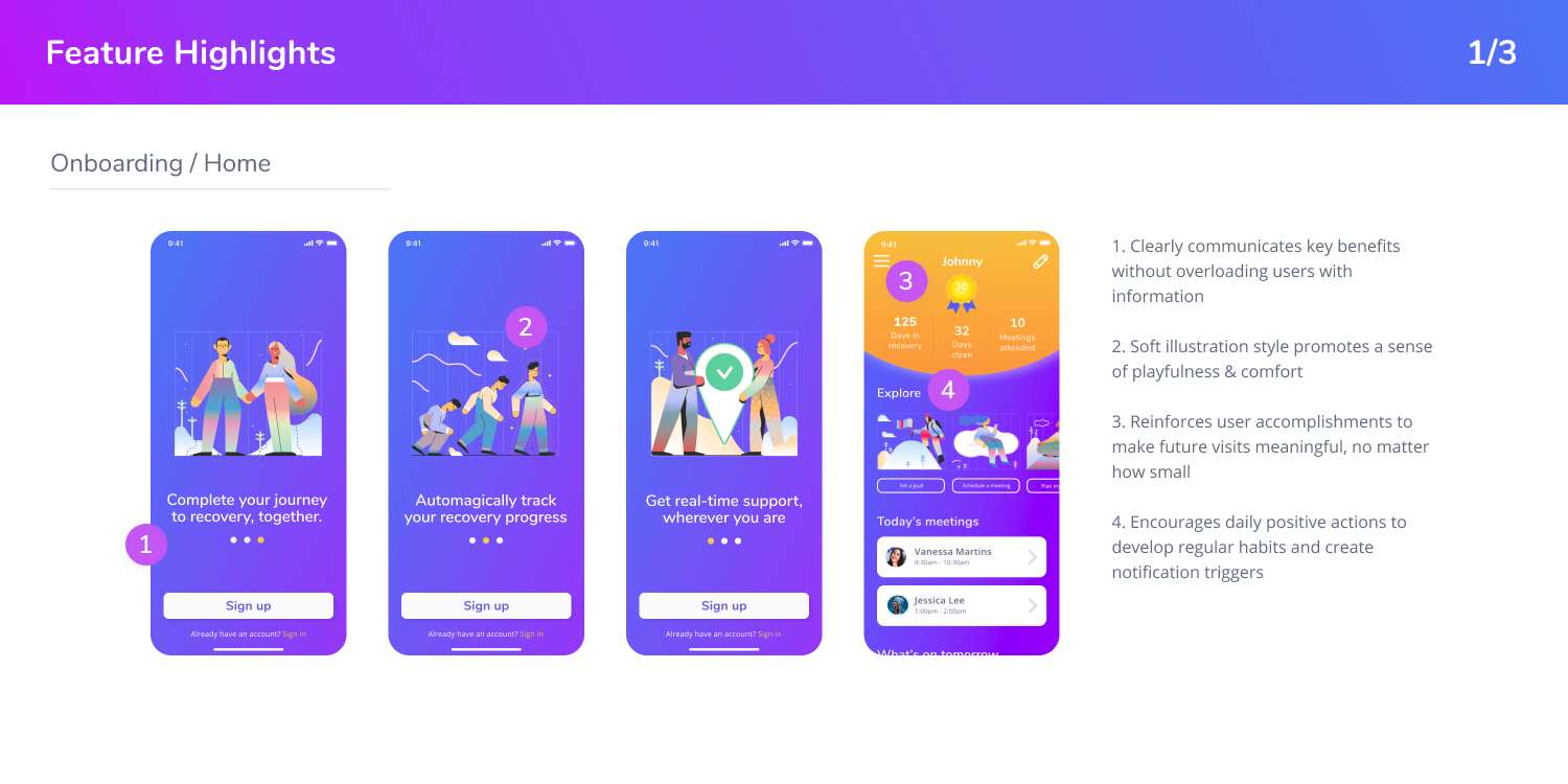
The final designs take cues from the fields of cognitive psychology, art, and nature. By leveraging existing tried & true component patterns from tools like Google Calendar and Zoom, I was able to focus on the front-end UI and microcopy. Here are a few of my favourite moments in the app:


IMPACT
Embracing the Agile methodology with a nimble team allowed me to bring the new HereNOW designs to life in 5 weeks. The live beta test begun in July, and despite being fresh out of the oven, HereNOW has already secured 4 new clients in the SUD category.
The work doesn’t stop here, though. As HereNOW continues to grow, we will be evolving the brand to service not just SUD patients, but their Care Providers and Family & Friends. Be sure to keep an eye out for new developments on HereNOWHelp.com!
